EECS 298: Social Consequences of Computing
Lab 8
Task
In this lab, you will build another simple machine learning model with the South German Credit dataset. After building the model, you will have some practice computing the demographic parity fairness metrics and plotting some results with matplotlib.
To get started, first download the South German Credit dataset using wget and then create a file called lab9.py in the same folder as the downloaded dataset.
$ wget https://raw.githubusercontent.com/eecs298/eecs298.github.io/main/files/south-german-credit-lab9.csv
Data - South German Credit Dataset
The South German Credit dataset has information on attributes of loan applicants related to their loan application. The target variable is LoanDefault which is 1 if the applicant does not default on their loan (i.e., they pay it back) and 2 if the applicant does default (i.e., they do not pay it back). Refer to the dataset documentation for more details on all of the included attributes.
Since we are going to be calculating a fairness metric in this lab, then we must define the sensitive attribute in this setting and it will be Age.
lab9.py
First, import numpy, csv, sklearn, and matplotlib in as follows and set the random numpy seed. If you need to install matplotlib, run pip install matplotlib in your terminal.
import numpy as np
import matplotlib.pyplot as plt
from sklearn import model_selection, linear_model
import csv

np.random.seed(298)
Read in south-german-credit-lab-9.csv however you’d like and separate all the features into a list called credit_training_features and all the labels (LoanDefault column) into a list called credit_training_labels. Make sure to cast all the data to ints as you read them in. As you read in the data, you are going to convert the Age variable to a binary variable in the following way
Age< 35, change the age to0.Age>= 35, change the age to1.
Next, split the data into training and testing sets using model_selection.train_test_split(credit_training_features, credit_training_labels). Then, train a LogisticRegression model on the training data. Finally, generate a prediction on the testing data. Refer to Lab 7 for a refresh on these steps using sklearn.
Now, we will use these predictions to calculate empirical probabilities to use in our fairness metric calculation.
Demographic Parity
Let \(A\) be a random variable for the sensitive attribute. In this case \(A\) is a binary variable to indicate each age category specified above. Let \(\hat{Y}\) be a random variable for the predicted label for each input. In this case \(\hat{Y}\) is 1 if an applicant is predicted to not default and 2 if they are predicted to default.
Recall the definition of demographic parity from lecture: \(P(\hat{Y} =1| A = \text{Age < 35}) = P(\hat{Y}=1 | A = \text{Age >= 35})\)
Calculate each probability above and store the results in a dictionary such that you print out the results as follows
Test probabilities: {0: 0.697841726618705, 1: 0.8288288288288288}
From these outputs, we can see demographic parity is not satisfied since the probabilities for each age category are quite different which implies that \(\hat{Y}\) is not statistically independent from \(A\).
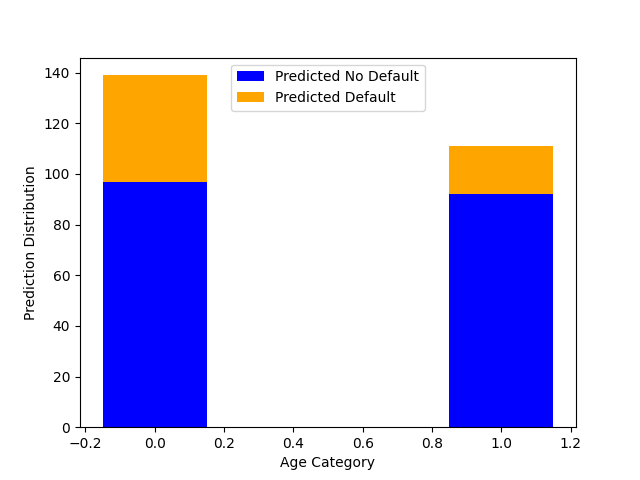
Finally, you will use matplotlib to plot a stacked bar graph which shows, for each age category, the number of inputs that received a prediction of 1 and the number of inputs that received a prediction of 2. You will use plt.bar() and you can read about the settings to create a stacked bar chart here
Your final bar graph should look as follows (don’t worry if your formatting is not exactly the same, but the shape of the graph should be the same):
Turn in lab9.py on Gradescope and turn in your bar graph to the Lab 8 Graph Submission on Gradescope as well.
Tips
Plotting a graph
Below gives an example of creating a simple plot using matplotlib.
import matplotlib.pyplot as plt # Import the library

# Data to graph
x = [1, 2, 3, 4, 5]
y = [5, 10, 15, 20, 25]

plt.scatter(x, y) # Create a graph
# Maps data pairs to x-y coordinates
# graph will include the points (1, 5), (2, 10), and so on

# Once a graph is created, you have a few options:
plt.show() # Open the graph in a pop-up window
plt.savefig(filepath) # Save the figure to the specified filepath
Customizing your graph
Find the list of all available colors here.
# Specify the color and label for your line
plt.plot(x1, y1, color="tab:blue", label= "Line 1 label")

# Can plot multiple lines per graph
plt.plot(x2, y2, color="tab:green", label="Line 2 label")

# Label your axes as follows:
plt.xlabel('Name of X-axis')
plt.ylabel('Name of Y-axis')

# Display a title on the graph:
plt.title("Title of graph")

# Show the legend and optionally specify its location to display the labels of each line
plt.legend(loc="upper center")
plt.show()